iPad RSS Reader Roundup
Finding a great RSS reader for the iPad hasn’t been as easy as I hoped. There are a lot that are pretty good, but none quite do everything I need/want. What I’m looking for is a reader that lets me quickly view headlines, then (if I’m interested) the article post/summary. Synching with my Google Reader account is a must, since I also read my many (too many?) feeds on my Mac (with NetNewsWire, if you were wondering). And finally, Instapaper integration is pretty much a requirement, too, since I often read articles later.
Many have additional features that I don’t use (tagging, quick blogging, sharing via social networks, saving/pinning/favoriting articles, etc.) so I won’t go into every app’s feature list. With that, here are quick reviews for some of the iPad RSS readers I’ve tried:
One of the most-hyped readers, Flipboard displays RSS feeds in a magazine-like layout. While not really an RSS reader by definition, I had to try it anyway. It’s cool (with page-turning UI), is well-done, and if your feeds regularly have good photography you end up with a very nice-looking “magazine.” While I find Flipboard nice to look at, I find that I tend to flip though it (much like a magazine) which doesn’t let me take in a lot of feeds quickly. It does sync with Google Reader, but going through them in Flipboard is tedious. If you just have a few RSS feeds and like the magazine format, Flipboard might be for you.
FLUD and Pulse News
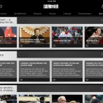
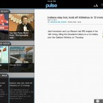
Flud (free) and Pulse (free) both display your feeds in a boxed format: categories run across the top, your feeds for that category are displayed horizontally (with photo, if available). While neither sync with Google Reader both apps can add feeds from your Reader account, but only Pulse lets you save items to Instapaper.
Like Flipboard, these seem to work better if you have fewer feeds to follow. Despite their similarity, I give the edge to Pulse: it’s a little easier to browse a feed while viewing an article (it allows you to see two items in the sidebar vs. Flud’s one) plus it supports Instapaper. But for what I want in a feed reader, I end up doing too much tapping with both Flud and Pulse to keep up with my feeds.
Feeddler
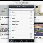
Feeddler (free; a $4.99 pro version is ad-free) requires Google Reader and is a more standard RSS reader: after logging in, you see a list of your categories on the left and the latest items on the right. Tap a category to drill down and view the feed; tap a headline to view the summary. It’s basic but gets the job done. Feeddler would be my RSS app of choice if not for one minor but important thing: it’s a bit hard to quickly read through a feed since tapping a headline opens the article in an overlay window. You then have to either close it before selecting another article, or simply go to the next or previous article — jumping around can’t be done quickly. (The free version also lacks Instapaper support, but the pro version has it.)
Reeder
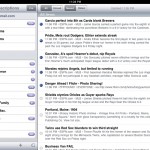
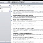
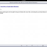
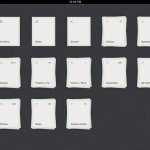
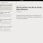
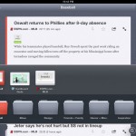
Reeder ($4.99) opens with a somewhat strange screen of category boxes. You then either tap the category box to view the all items of the category’s feeds, or pinch & zoom to view and select the individual feeds in the category. It’s kind of a neat UI, but I think a more standard menu selection (like Feeddler’s) would be easier and quicker. However, once you’re viewing a category or feed, it’s great: article headlines & short summary are displayed along the left column, which you tap to display in the main section. You can tap the article headline to view the web page, or save to Instapaper (or other service). And you can easily browse headlines and still keep the article visible.
The Feed
The Feed (free) is a somewhat strange reader (to me). Folders are somewhat hidden and are accessed by tapping the Feed icon in the bottom left, horizontal-scrolling and selecting the folder you want, then the feed you want. Articles are then displayed in large gray boxes (which can be zoomed out to view more at a time). By not showing just the headlines, however, you have to do a lot more scrolling. Again, this app might work better for a small number of feeds, but this was my least favorite.
My Pick
 If you’re like me and follow a lot of RSS feeds and want to be able to quickly scan, read and save articles, I recommend Reeder. You can scan your feeds (singular or by category) quickly without having to open and close windows or be forced to use just previous/next navigation. If you’re more interested in a UI and layout more fitting of your cool iPad, definitely try Flipboard. But for filtering, reading and saving a lot of information as quickly as possible, Reeder is the way to go for me.


