Customize Your Twitter AccountKieran Chapman2010-04-27T16:16:33-04:00
Don’t Forget Your Twitter Design!
– Customize your Twitter account in three steps
RIGHT IMAGE
I’m always surprised when I see that a company has a Twitter account but hasn’t taken the steps to customize it. It’s very easy to customize Twitter, mainly because your options are so limited. So “extend your brand” (bleah) in three steps:
Step 1: Your Icon
The bird may be cute, but change it. Use your photo, company logo…something like that. A square image works best. Go to Twitter’s Settings > Profile > Picture
Step 2: Background Image
The background image can either be tiled (repeated) or just appear in the top left. If you’re using a tiled image, please make sure it doesn’t look GeoCities-hideous. Many people use a really large background image which would be a faux pas if this were 1998, but luckily most people aren’t on dial-up anymore. (Mobile web is a different story, of course.)
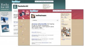
The one issue with Twitter’s non-tiling background is that you can’t position it: it’s just set in the top left corner of the user’s browser but the actual page is centered on the screen, so people with smaller screen resolutions may not see all of your background image. Compare:
IMAGE
It’s best to test your background image with various screen sizes to optimize it as much as you can. (If you’re hiring someone to do this, a competent designer is already doing this for you.) Change your background image at Twitter’s Settings > Design > Change background image
Step 3: Colors
Finally, update your background, text and link colors. If you’re using a static background image, this is where you make sure the background color blends seamlessly with your image. Color settings are in Settings > Design > Change design colors
Further Reading
Looking for more Twitter customization inspiration and ideas? Here are a few sites to check out:
Twitter Background Design How-To and Best Practices
http://www.blog.spoongraphics.co.uk/tutorials/twitter-background-design-how-to-and-best-practices
20 Creative Twitter Designs and what makes them cool
http://dropthedigibomb.com/2009/20-creative-twitter-designs-and-what-makes-them-cool/
Make a Good Impression with a Custom Twitter Background
http://www.twitip.com/custom-twitter-backgrounds/

I’m always surprised when I see that a company has a Twitter account but hasn’t taken the steps to customize it. It’s very easy to customize Twitter, mainly because your options are so limited. So “extend your brand” (bleah) in three steps:
Step 1: Your Icon
The bird may be cute, but change it. Use your photo, company logo…something like that. A square image works best. Go to Twitter’s Settings > Profile > Picture.
Step 2: Background Image
The background image can either be tiled (repeated) or just appear in the top left. If you’re using a tiled image, please make sure it doesn’t look GeoCities-hideous. Many people use a really large static background image which would be a faux pas if this were 1998, but luckily most people aren’t on dial-up anymore. (Mobile web is a different story, of course.)
The one issue with Twitter’s non-tiling background is that you can’t position it: it’s just set in the top left corner of the user’s browser, but the actual page is centered on the screen. So people with smaller screen resolutions may not see all of your background image. Compare:

It’s best to test your background image with various screen sizes to optimize it as much as you can. (If you’re hiring someone to do this, a competent designer is already doing this for you.) Change your background image at Twitter’s Settings > Design > Change background image.
Step 3: Colors
Finally, update your background, text and link colors. If you’re using a static background image, this is where you make sure the background color blends seamlessly with your image. Color settings are in Settings > Design > Change design colors.
Further Reading
Looking for more Twitter customization inspiration and ideas? Here are a few sites to check out:


