yav Form ValidationKieran Chapman2010-04-27T15:25:04-04:00
yav Form Validation
– Make form validation (a little) easier with yav.
Forms are a way for your site’s users to contact you, place orders, complete a survey — in general, provide you with important information. So, it’s very important that forms are clear, well-designed, and easy to use.
Validating online forms is a pain from a developer’s point of view, but necessary for a good user experience. If a user does make a mistake completing a form — such as omitting a required field or entering an invalid email address — you want to let them know right away so they can fix it before submitting the data. And it’s best to show the error right away without refreshing the page or having to user search for what might be wrong. (A somewhat-old but still-relevant article by UIE is worth a read: <a href=”http://www.uie.com/articles/form_design_wild/”>Web Form Design in the Wild, Part II</a>.)
<a href=”http://yav.sourceforge.net/>yav</a> is Javascript form validation tool that does a great job handling form validation. It’s good for both simple validating (such as requiring a field or checking for a valid email address) and more complex rules (if your country = United States then require the State field; if your country = Canada, require province). You can even write custom Javascript functions if you need require even more specific validation rules.
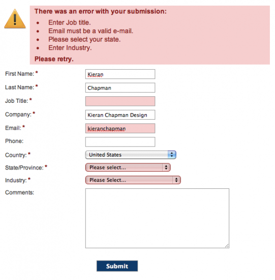
yav also gives you options for displaying form errors. You can list the errors in a single section above the form, which works well with shorter forms:
IMAGE
You can also display error messages inline, which is better for longer forms. You don’t want users to have to search for their error, so calling out the error next to the field that needs correcting makes it easy to find:
IMAGE
yav’s config settings let you change error message text, and you have total control over the look of the errors using CSS. The only downside is that it’s not terribly well-documented, so if you’re unfamiliar with Javascript you’ll probably require some trial & error to get things to work like you want them.
Forms are a way for your site’s users to contact you, place orders, complete a survey — in general, provide you with important information. So, it’s very important that forms are clear, well-designed, and easy to use.
Validating online forms is a pain from a developer’s point of view, but necessary for a good user experience. If a user does make a mistake completing a form — such as omitting a required field or entering an invalid email address — you want to let them know right away so they can fix it before submitting the data. And it’s best to show the error right away without refreshing the page or having to user search for what might be wrong. (A somewhat-old but still-relevant article by UIE is worth a read: Web Form Design in the Wild, Part II.)
yav is Javascript form validation tool that does a great job handling form validation. It’s good for both simple validating (such as requiring a field or checking for a valid email address) and more complex rules (if your country = United States then require the State field; if your country = Canada, require province). You can even write custom Javascript functions if you need even more specific validation rules.
yav also gives you options for displaying form errors. You can list the errors in a single section above the form, which works well with shorter forms:

You can also display error messages inline, which is better for longer forms. You don’t want users to have to search for their error, so calling out the error next to the field that needs correcting makes it easy to find:

yav’s config settings let you change error message text, and you have total control over the look of the errors using CSS. The only downside is that it’s not terribly well-documented, so if you’re unfamiliar with Javascript you’ll probably require some trial & error to get things to work like you want them.


