Fun with Responsive Web Design
 One of the most useful and eye-opening books I read last year was “Responsive Web Design” by Ethan Marcotte. It “explore[s] CSS techniques and design principles” and “demonstrat[es] how you can deliver a quality experience to your users no matter how large (or small) their display” (quoted from the ABA website).
In short, he tells you how you can use CSS to optimize a single website for various screen sizes — large monitors, smaller tablets, tiny phones — using CSS. I think this is great for everyone involved on the web:
- Users won’t end up seeing the “wrong” version of a site, like when someone sends you a link to “m.website.com” from their mobile device, which in turn looks ridiculous on your computer screen.
- IT people no longer have to manage two versions of the same site (regular and mobile).
- Designers and developers only deal with a single site and code, with CSS making the layout decisions based on the screen it’s on.
Of course, responsive web design has its own challenges, but personally I find it fun and exciting (which leads me to believe that I’m in the correct profession).
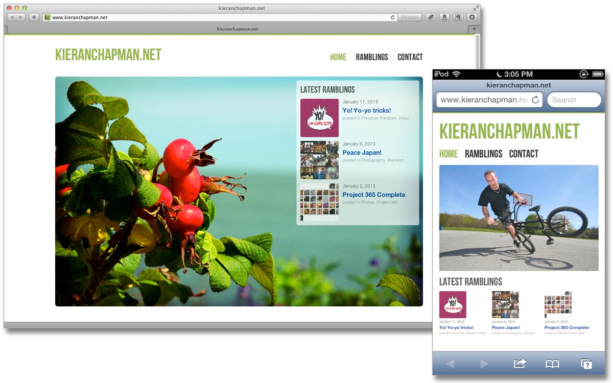
As a quick learning experience, I optimized my personal site (kieranchapman.net) for mobile devices using only CSS. The home page normally has a large photo with the latest blog posts overlaid in the top right. This layout works fine on monitors and tablets, but the text was far too small on my iPhone. So now on smaller screens the home page rearranges itself using CSS, displaying a smaller main photo with the blog posts below it.
The navigation links also have been moved below the logo, and on subpages the sidebar has been moved below the main page content. All of this makes for a much easier reading experience on mobile devices, all easily handled using CSS.


